The Intuitive
Vue UI Library
Create beautiful, responsive & accessible web apps quickly with Vue or Nuxt. Nuxt UI is an open-source UI library of 100+ customizable components built with Tailwind CSS and Reka UI.
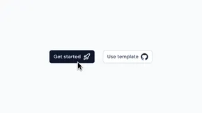
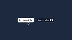
Get startedGet startedExplore components
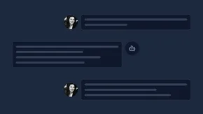
Styled with Tailwind CSS
Beautifully styled by default, overwrite any style you want.
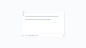
Accessible with Reka UI
Robust accessibility out of the box.
Type-safe with TypeScript
Auto-complete and type safety for all components.

- Go to Build for the modern web
Build for the modern web
Powered by Tailwind CSS and Reka UI for top performance and accessibility.
- Go to Flexible design system
Flexible design system
Beautiful by default and easily customizable with design tokens to your brand.
- Go to Internationalization (i18n)
Internationalization (i18n)
Nuxt UI is translated into 50+ languages, works well with i18n and multi-directional support (LTR/RTL).
- Go to Easy font customization
Easy font customization
Performance-optimized fonts with first-class @nuxt/fonts integration.
- Go to Large icons sets
Large icons sets
Access to over 200,000 customizable icons from Iconify, seamlessly integrated with Iconify.
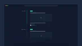
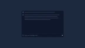
- Go to Light & Dark
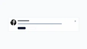
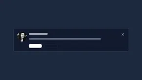
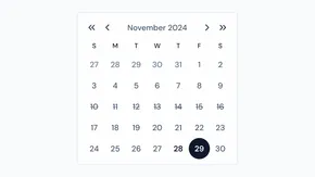
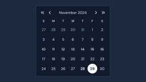
Light & Dark
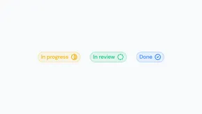
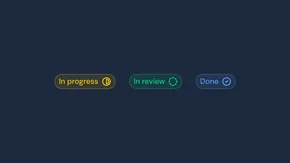
Dark mode-ready components, seamless integration with @nuxtjs/color-mode.
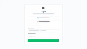
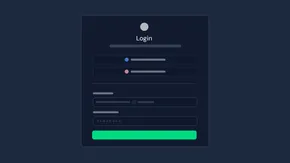
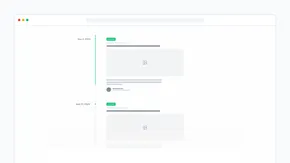
Flexible design system
Build your next project faster with Nuxt UI's comprehensive design system. Featuring semantic color aliases, comprehensive design tokens, and automatic light/dark mode support for accessible components out of the box.
- Color aliases via AppConfigConfigure 7 semantic color aliases (primary, secondary, success, info, warning, error, neutral) at runtime through AppConfig without rebuilding your application.
- Comprehensive design tokensExtensive set of neutral palette tokens for text, backgrounds, and borders with automatic light/dark mode support via CSS variables like --ui-text, --ui-bg, --ui-border.
- Global style variablesCustomize global styling with --ui-radius for consistent border rounding and --ui-container for layout widths across your entire application.
export default defineAppConfig({
  ui: {
    colors: {
      primary: 'indigo',
      secondary: 'pink',
      success: 'green',
      info: 'blue',
      warning: 'orange',
      error: 'red',
      neutral: 'zinc'
    }
  }
})
@import "tailwindcss";
@import "@nuxt/ui";

:root {
  --ui-radius: 0.25rem;
  --ui-container: 90rem;
  --ui-bg: var(--ui-color-neutral-50);
  --ui-text: var(--ui-color-neutral-900);
}
.dark {
  --ui-bg: var(--ui-color-neutral-950);
  --ui-border: var(--ui-color-neutral-900);
}
Powerful component customization
Nuxt UI leverages Tailwind Variants to provide a powerful, maintainable system for managing component styles and intelligently merging Tailwind CSS classes without conflicts.
- Powerful slot and variant systemCustomize component parts with slots and apply different styles based on props, creating consistent UI patterns with granular control over styling.
- Global theme with AppConfigConfigure component styles project-wide with a centralized AppConfig that maintains consistency across your application without rebuilding.
- Per-component customizationFine-tune individual components with the ui prop for slot-specific styling and class prop for root element overrides, providing maximum flexibility.
export default defineAppConfig({
  ui: {
    button: {
      slots: {
        base: 'group font-bold',
        trailingIcon: 'group-data-[state=open]:rotate-180 transition-transform duration-200'
      },
      defaultVariants: {
        color: 'neutral',
        variant: 'subtle'
      }
    }
  }
})
<template>
  <UCollapsible>
    <UButton
      label="Open"
      color="neutral"
      variant="subtle"
      trailing-icon="i-lucide-chevron-down"
      :ui="{
        trailingIcon: 'group-data-[state=open]:rotate-180 transition-transform duration-200'
      }"
        class="group font-bold"
      />
  </UCollapsible>
</template>
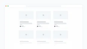
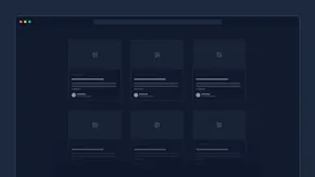
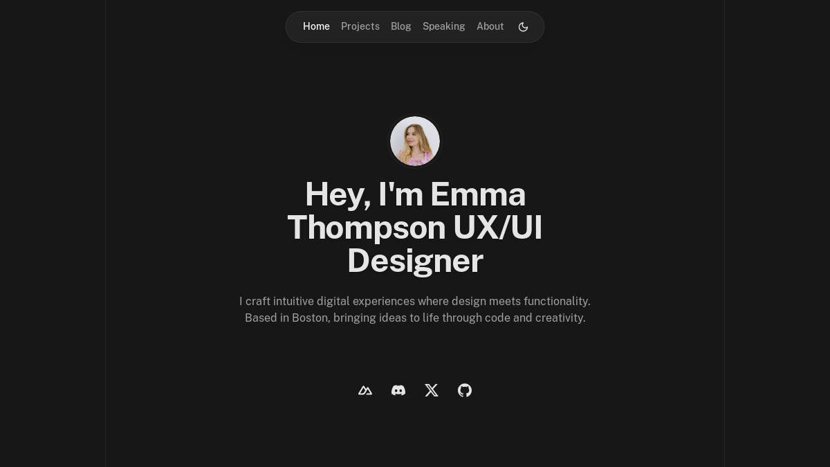
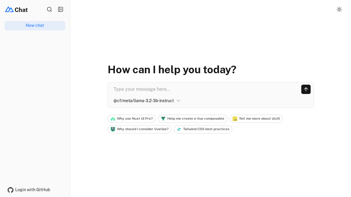
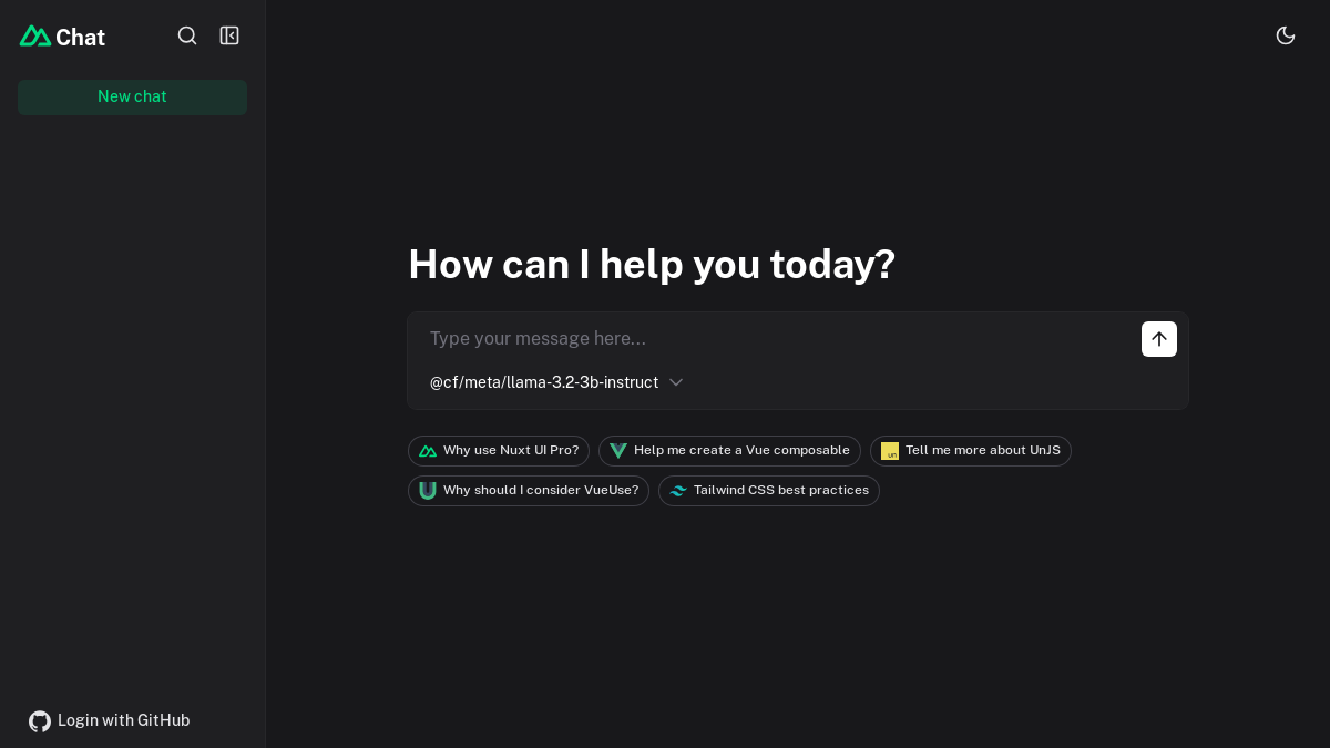
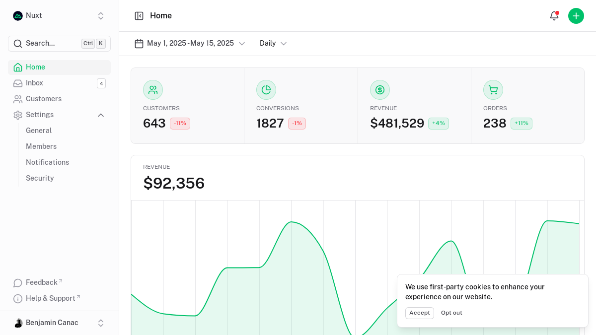
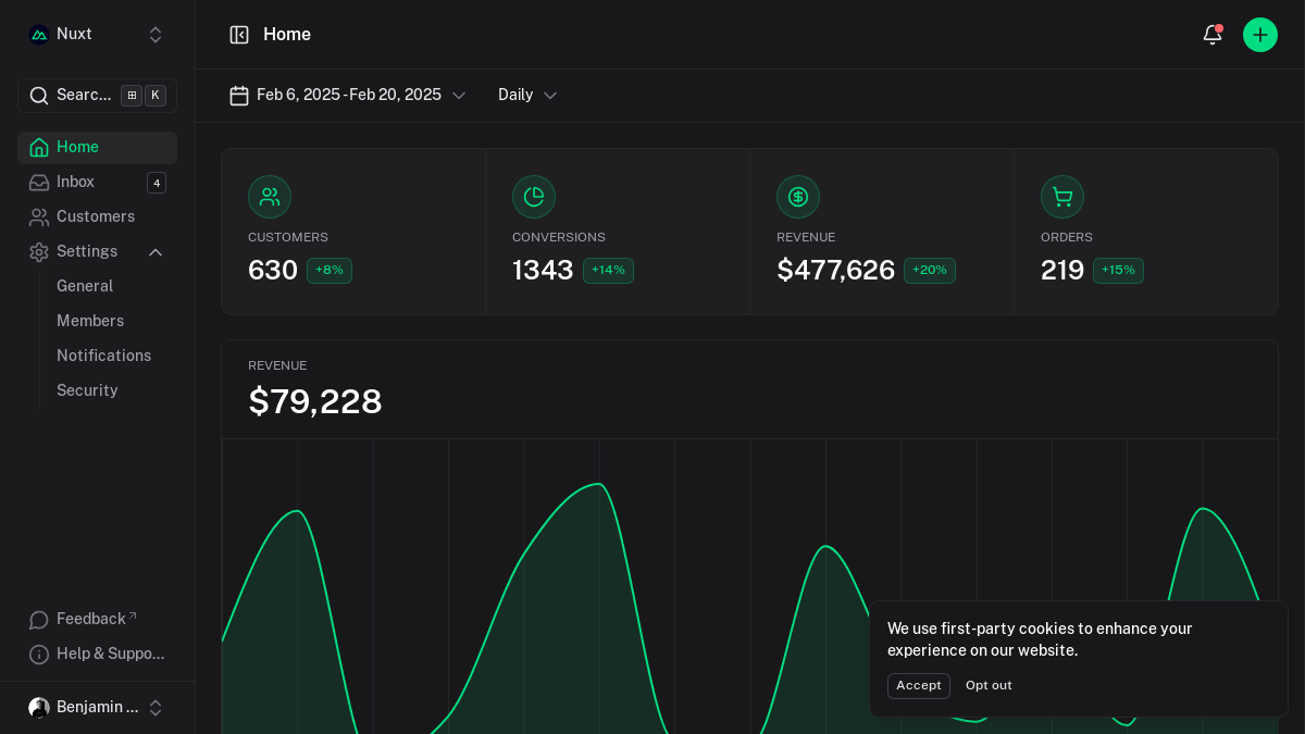
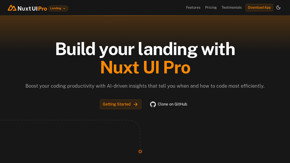
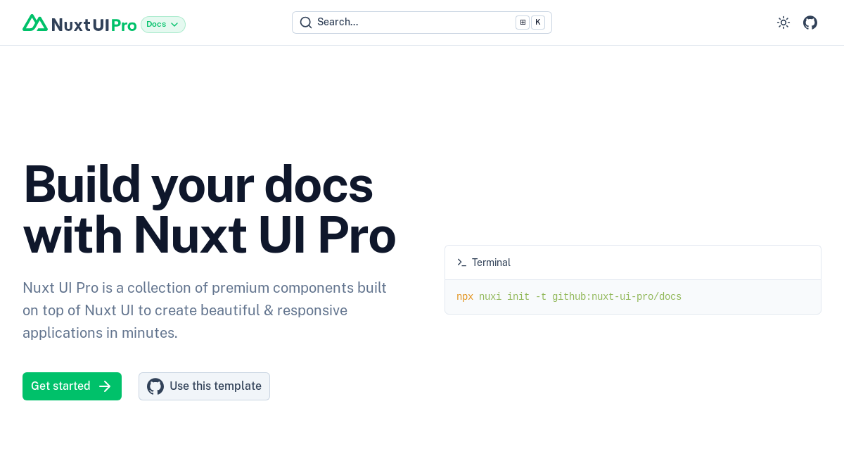
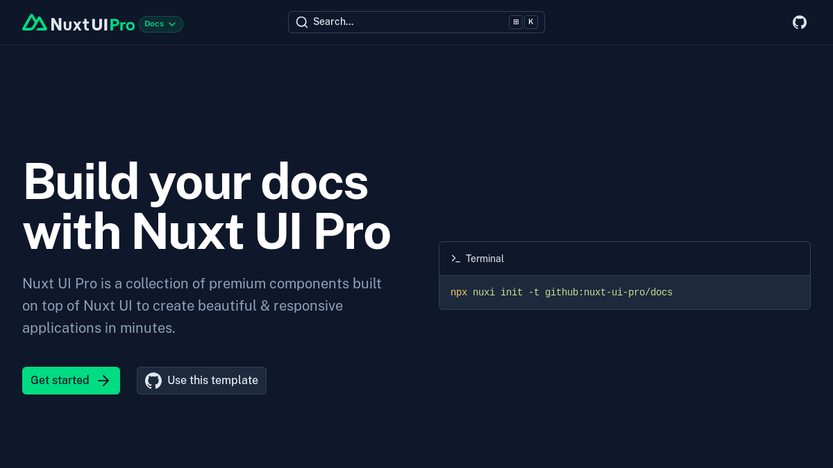
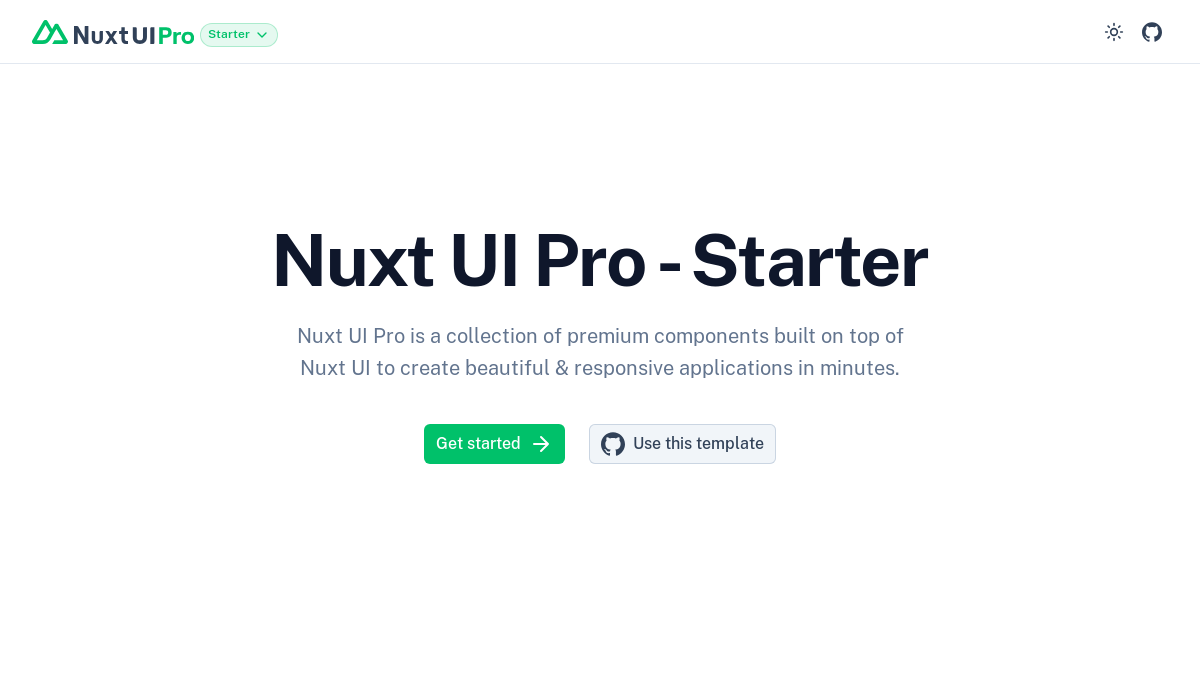
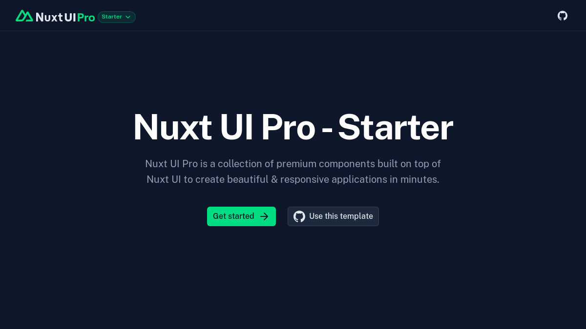
Build faster with official templates
Explore ready-made templates powered by our Vue components. These templates are fully responsive, accessible, and easy to customize, so you can launch your project quickly and effortlessly.
- Production-ready templatesAll templates are built with best practices, SEO optimized, and ready to deploy to production immediately.
- Nuxt & Vue supportTemplates available for both Nuxt and Vue applications, choose the framework that best fits your needs.
- Customizable & extensibleBuilt on top of Nuxt UI components, easily customize colors, fonts, and layouts to match your brand.
Nuxt UI open-source community
Join our thriving community to contribute code, report issues, suggest features, or help with documentation. Every contribution makes Nuxt UI better for everyone.